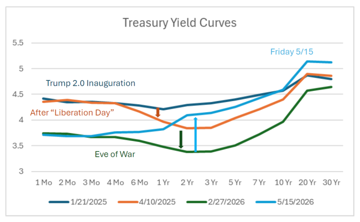

Reversing the pattern of declining curves, the curve has steepened since the War’s start.
Figure 1: Yield curve as of 1/21/2025 (blue), as of 4/10 (tan), as of 2/27 (green), and as of 5/15 (sky blue), all in %. Source: Treasury.
My interpretation: 1 to 3 year maturities fell as “Liberation Day” tariffs heightened fears of a slowdown. Continued policy uncertainty and lowered Fed funds rates kept pushing down yields at all horizons until the eve of the War. Then the war pushed up anticipated short rate 3 months hence (relative to prior expectations), and higher inflation at the 6 month to 10 year horizon. Presumably, elevated deficits associated with war expenditures also put upward pressure at the long end.
Higher sovereign risk might also explain the steepening of the curve as of 5/15, as 5yr CDS spreads on Treasurys have risen from 31 to 37 today.

 By
By